


38 | How to design a book
an interview with Kris Pyda on an evolving art

Everyone has a book in them apparently, says the double digit percentage growth in self-published books on Amazon. But most of those books have shitty design.
And this is fine, I suppose. Most of them are not a creative act, but a marketing one. They are pumped out by wellness and business coaches, marketing savants and self-help gurus to signal authority and experience (in the same way MrBeast needs a standard TV show format to signal he’s “arrived”). That’s why they feel like standard textbooks, with the occasional graph or image making an appearance. Their biggest creative need is likely little more than a cover design that renders well as a JPG on their web sites.
Our intention with Not a Playbook was different. So co-author Damian Bradfield hired a couple of savvy and accomplished book people to take my basic Pages document and spin it into the tactile expression of the story of WeTransfer.
I didn’t know Berlin-based Kris Pyda before he showed up on a Zoom call with another Kris — the talented book producer Kris Latocha based in Brooklyn. But over the course of the next five months, I won a profound appreciation for the intricate work and creative vision that goes from turning a Pages document into a 151-page book printed on two different types of paper.
Polish-born, Kris began his career after finishing university in Berlin in 2012. His first clients were avant garde artists, an evolving group of eastern European conceptualists of the type that used to flock to Berlin in droves. Working on their monographs and retrospectives taught him the magic in the unpredictable, and enabled him to be far more experimental than the more traditional design work being done in major publishing houses.

In many ways, that’s what book publishing demands in 2025. Our reading behavior is digitally dominated, so the opportunity for books is not just to serve as attractive artifacts in the background of a Zoom meeting, but as experiences in and of themselves.
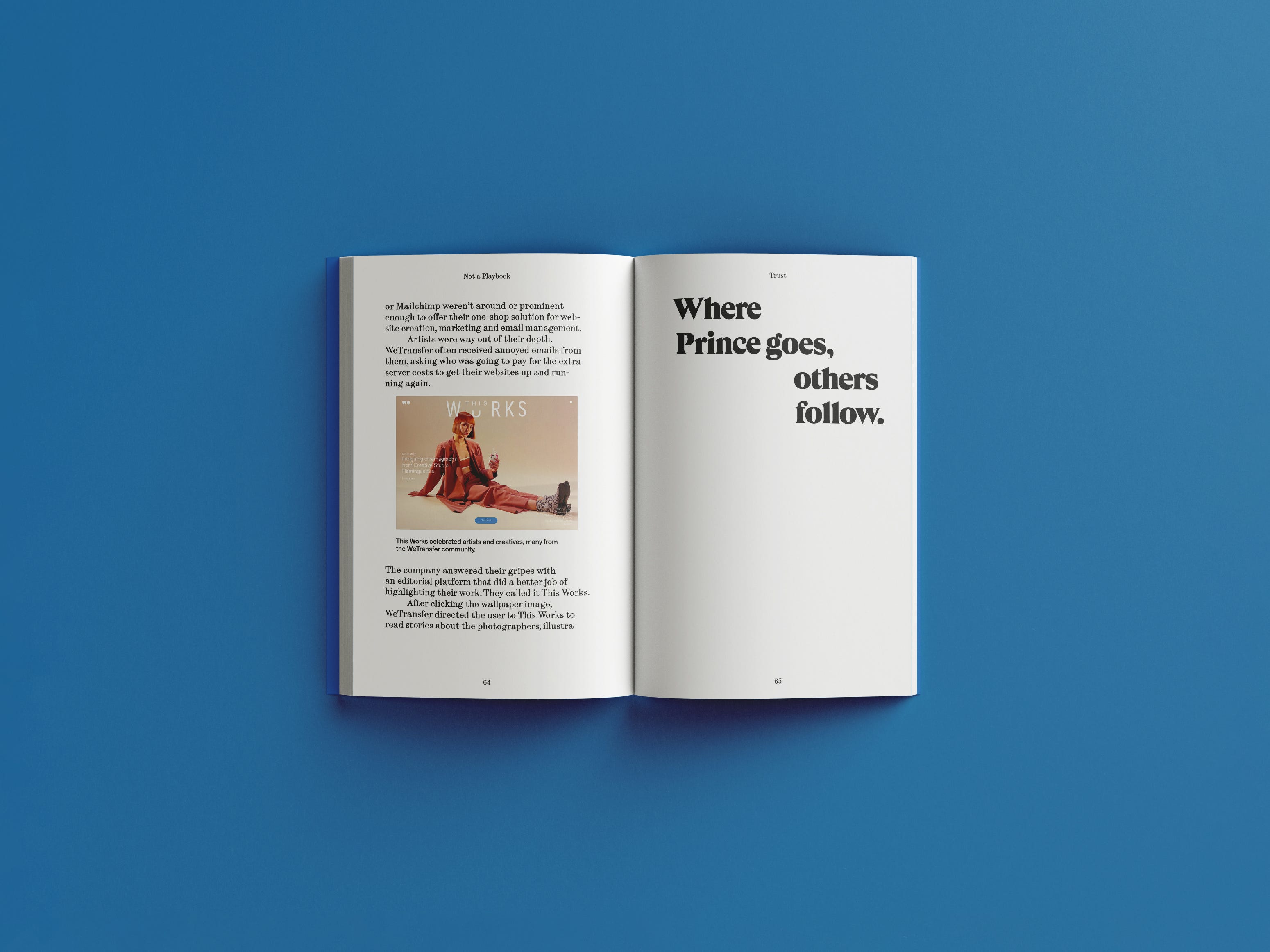
That’s how Kris thinks of it, anyway. And Not a Playbook benefited greatly from his approach: in the off-set paragraphs he introduced at key moments in the text, the clever chapter opening designs he made, or the mycelium-inspired WeTransfer “collaboration taxonomy” he created for the inside and back covers.
Below, more from a man (here’s his web site by the way) who spends a lot of time thinking about words and pictures on paper.
Book design needs to work especially hard in the digital age. How do you think about that competition for attention?
I think about this all the time, to be honest. I mean, first of all, whenever I approach any book design, I generally think about the feeling you get when you hold it in your hands. How it opens up and how you flip the pages. You can put a piece of a thicker paper in between, and then you’re pretty certain that someone opening the book will open that page ... We had those conversations about how this book should be easy to read, from the beginning to the end. But also, it should be exciting to flip through it, so we consciously tried to find a way that it could be approached in, like, an airport shop, just before leaving on a flight.
So your role is not just laying words out, but thinking about the different ways to experience a book?
Whenever there is money spent on print, you want to do something with it that otherwise would not exist. Like, it couldn't exist in any other form. That's the most interesting part for me when you do a book. How do you do it in a way that it's not just a text and pictures, but that takes the work to a different level and adds to it, you know, that you could only consume it in that way? This is the fun part.
You came in after I’d finished six or seven drafts already. But it wasn’t final, final. What was helpful about coming in at that point?
I think from the perspective of a designer it makes it way more interesting … You’re trying to be additive, and not make it more difficult to convey the information. So, in that way, you have much more influence on things which hopefully, makes everything more accessible and exciting and kind of intriguing for the reader. I think that’s the cool part about approaching the book from more of an artistic perspective, the freedom to have that flexibility.
Do you typically go in with an idea of how you’ll lay it out?
It really depends. Sometimes you realize, okay, this book would fit like specific type of layout or you already have a concept for it. Here, I think elements were clearly inspired by the text: Those sentences that you throw in that are sort of like these hanging points … those things kind of like asked for being on a display or having their own little indent. That was pretty clear to me, to show the process of thinking … because the text really was sort of like an internal conversation. It also felt nice to have those points in a layout, those brief moments of air. All those tiny decisions we made were really dictated by the flow of thoughts in the book.
E-books are the fastest growing sector of book publishing, and this sort of hand-made approach to bookmaking … almost book-crafting … feels like it’s of another era.
Clearly bookmaking is now becoming more exclusive, sort of like making a luxury product. I think there's no denying that this is the only reasonable approach to making books [these days], because everything goes off the paper slowly. So even with that in mind, you want that book to be special, you know, like in terms of material. So it feels like something special.
I imagine that’s more exciting for you.
What is interesting is that there is much more space for an experimental approach. It’s not only about sharing the ideas, but also affecting how the reader perceives it or experiences it. This makes the work way more interesting because you can influence all parts of that experience. It's not only consuming the ideas and being excited about them, but it also maybe helps the ideas to be more deeply explored … It brings much more out of the content.`
The book is stunning. Appreciated reading this exchange!